BUSINESS SUPPORT & TRAINING
SiGNAL Tech Tips: Creating Visual Data in Excel

5 Ways to enhance the presentation of your Excel Spreadsheets
Quite frankly, a spreadsheet of numbers for most people is essentially boring! All those numbers, but what are they telling me, and what do they mean? Using one of Excel’s built-in options to enhance your presentation, you can improve the way your spreadsheets are presented in seconds.
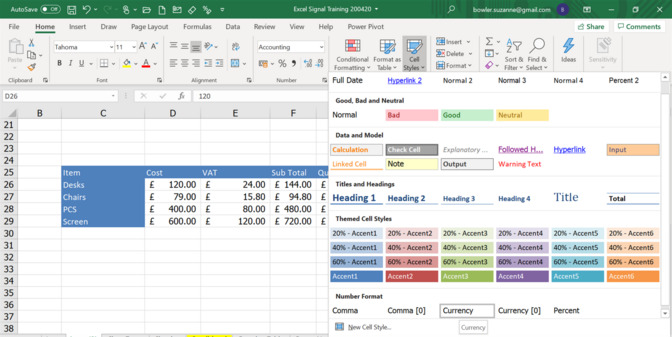
1. Cell Styles: these are like Word Styles. They are preset Styles within Excel to apply to numbers and text to ensure that the presentation is consistent. Go to the Home Ribbon, select Cell Styles and select a style appropriate for the selection of cells you are in. You can even create your own Styles.
2. Sparklines: are an Excel hidden gem! They are mini charts embedded within the cell in the form of lines or bars. They can be copied down to display how sets of numbers are performing visually. Click on a cell to the right (or inappropriate cell) of a range of numbers. Click on Insert>Sparklines and select the sparkline that you prefer. You will need to enter the range of data on which the sparkline is based on.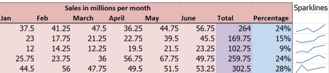
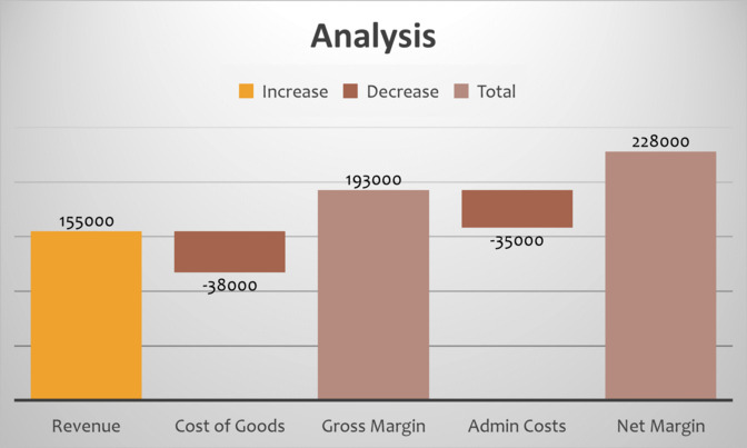
3. Charts: - of course charting is the most common way of visual representation of numerical data. Bar Charts, Column Charts, Line Charts and Pie Charts are all used regularly. Charts can be found in the Insert Ribbon. However, there are now 3d Map Charts if you need to represent data based on location, and additional charts which have been released in the later version of Excel such as Waterfall Charts (example below). When you have created your chart ensure you select suitable colours using the Chart Design and if the chart is to be published externally then use appropriate colours to your branding.
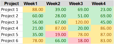
4. Conditional Formatting: this is an exciting way of presenting numbers. This was brilliant when it was first introduced as prior to this lovely button, there were many complex ways to achieve what you can just click a button for now! The best way of reviewing conditional formatting is to look at 3 various examples of it being applied to some data.
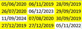
- Our first example looks at colouring a range of cells based on their values. In this example all numbers less than 20 are in red, 20 to 75 are in green and over 75 are in yellow. This has been achieved by selecting the same range in Conditional Formatting in the Home Ribbon and then using the Highlight Cell Rules option with a different colour for each range.
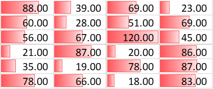
- The second example looks at the same set of figures but displays them as coloured data bars. This is where the amount of colour in the cell is based on the value according to the highest value in the range. Note the cell with 120 is completely red. From the Home Ribbon, select Conditional Formatting, Data Bars
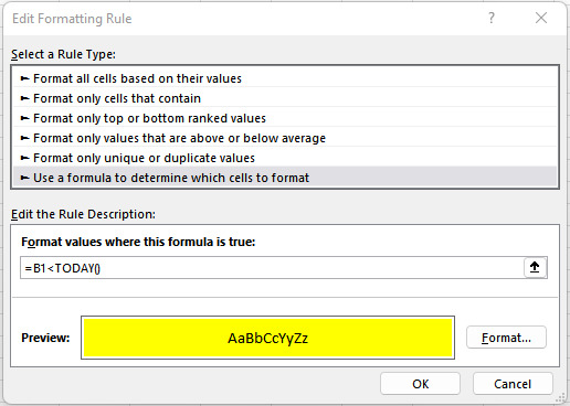
- Our final conditional format is based on a formula, which looks at a range of dates and when the date becomes historical, the cell format will change to a yellow background. To do this select all the cells in the range and then from Conditional Formatting on the Home Ribbon, select New Rule, then ‘Use a Formula to determine which cells to format. In the Format Values ‘where this formula is true box’, Enter the formula (starting with =) in the formula box (the formula references the active cell which is usually the first cell, and the conditional formatting tool will adjust it for the other cells if relative referencing is used). For example, enter =B1<TODAY() if B1 is the first in the range of selected cells containing a date. . Click Format and a dialog box appears. Click the Fill tab and then click the desired fill colour. You can also click the Font tab and select a font colour or another format such as bold. Click OK twice.
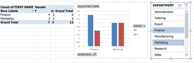
5. Charts with Slicers: these are an excellent way of presenting Pivot Tables. Once you have your Pivot Table you can use the Slicer object to add to the Pivot Table to enable users to be able to view different data options at the click of a button. Once you have a Pivot Table in your spreadsheet, from the Insert Ribbon select Slicer and then identify which Label you would like the slicer to use. In this example, we have used Department.
From this article, you can see that there are many ways of presenting the data in your spreadsheets in a much more attractive and appealing way. Where possible use colours which match your branding and instantly the reports will be transformed.
To finish off, if you are presenting your data in Word or PowerPoint ensure that you copy the data that you require and paste it into Word or PowerPoint as an image, you will find it much easier to manipulate your image than the data!
If you are interested in Microsoft Train, please visit our events page for all upcoming training sessions. HERE